
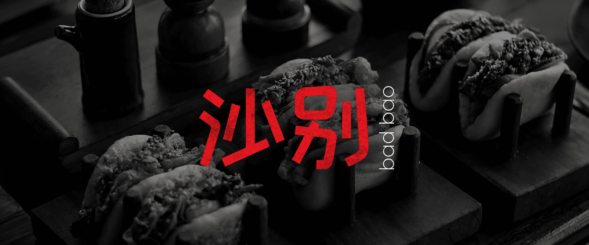
Bad Bao
Bad bao is a street food concept built around baozi — steamed filled buns that have grown from an Asian classic into a global fast food trend. The client came to us at launch stage: a great product, but no face. The task was to build the brand from scratch — from name and logo to packaging and signage — so the new spot would look like an established brand from day one, not "just another Asian eatery."
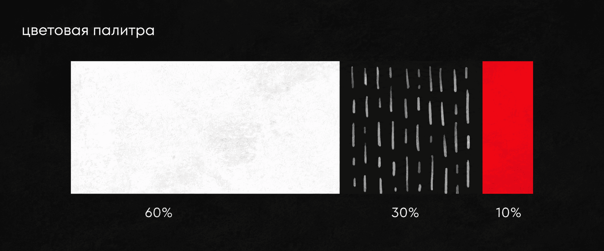
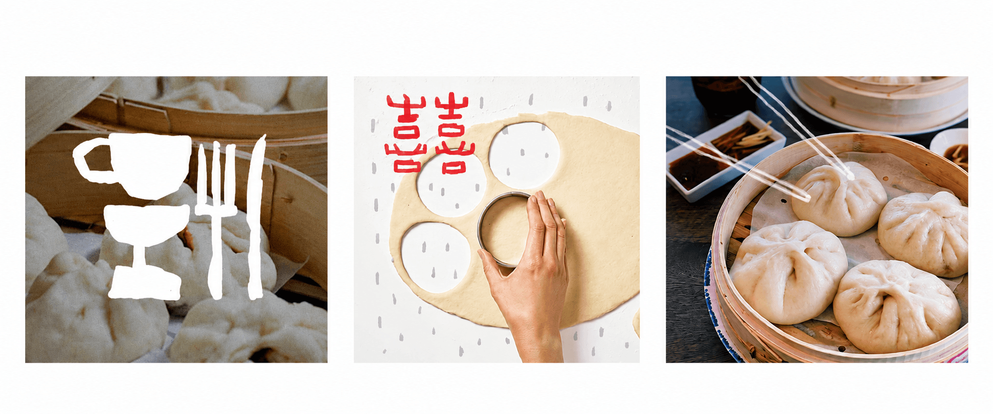
The name Bad bao set the tone itself: we played on the contrast between a "bad boy" attitude and a soft, fluffy steamed bun. We developed this idea into a full identity — a distinctive logo, a set of brand icons and illustrations, bold typography, and a color palette that works equally well on a takeaway box and a neon sign. The brand has real character: impossible to confuse with competitors, yet still all about the food — appetizing and clear.
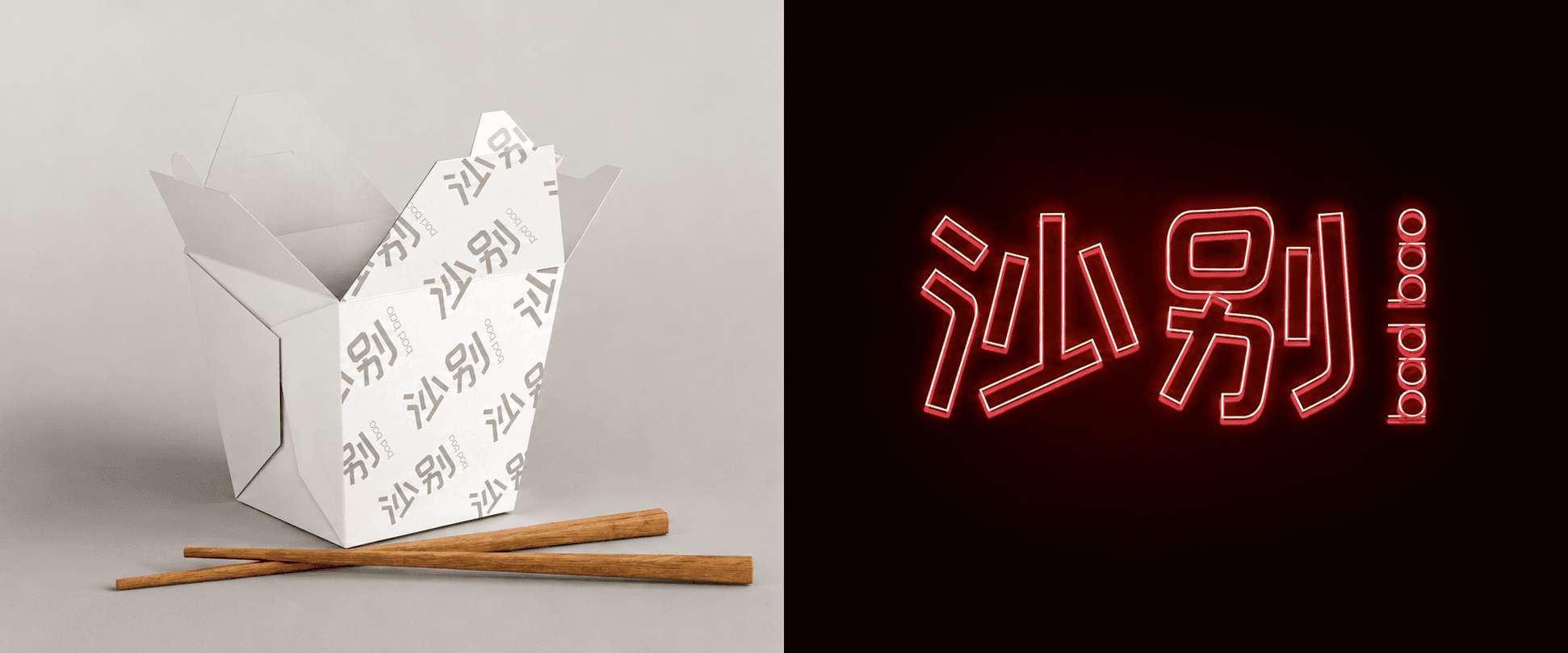
We rolled the visual identity out to every point of contact with the guest: box and sticker design, sauce packaging, the menu, interior posters, a neon sign, and staff uniforms. Every carrier is built from the same identity elements, so the brand is recognizable in any context — from a delivery bag to a photo in someone's stories. The client got not just a logo, but a ready-made system that scales easily to new carriers and new locations.
Results
Within a single project, the client received a complete identity: logo, brand icons, packaging, menu, posters, signage, and staff uniforms. The location launched with zero "temporary design" — the brand was 100% ready from day one.
Every carrier follows one visual logic. New assets — a seasonal menu, promo posters, merch — can be assembled from existing elements without calling in an agency for every small task.
The brand's bold character sets Bad bao apart from generic Asian cafés and turns the packaging into a media channel of its own: a branded box drives recognition in delivery and on social.