
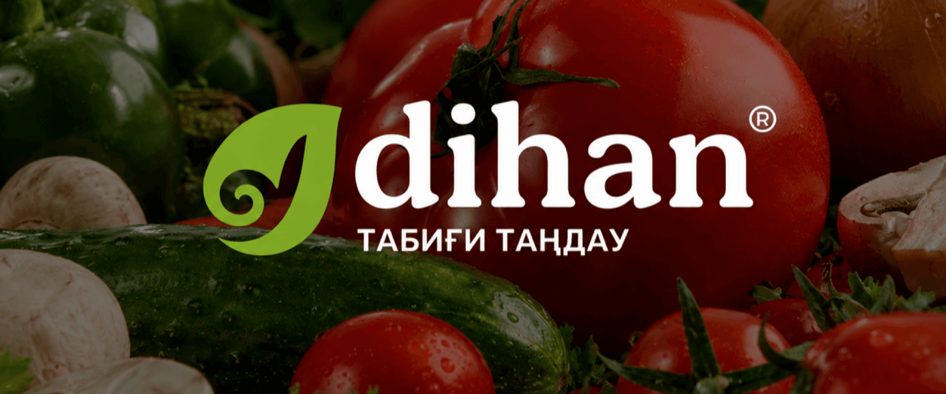
Dihan
Dihan is a network of fresh fruit, vegetable, and herb stores in Atyrau. The business combines its own production and warehouse infrastructure with retail, wholesale, HoReCa, tender supply, and local fair channels.
Our task was to shape a coherent and recognizable image that communicated freshness, natural quality, and local origin. The brand needed one visual system connecting its social presence, profile design, and outdoor advertising.
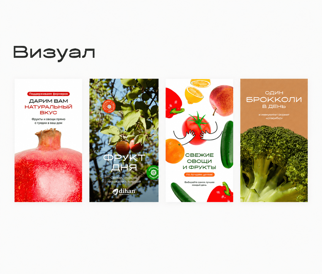
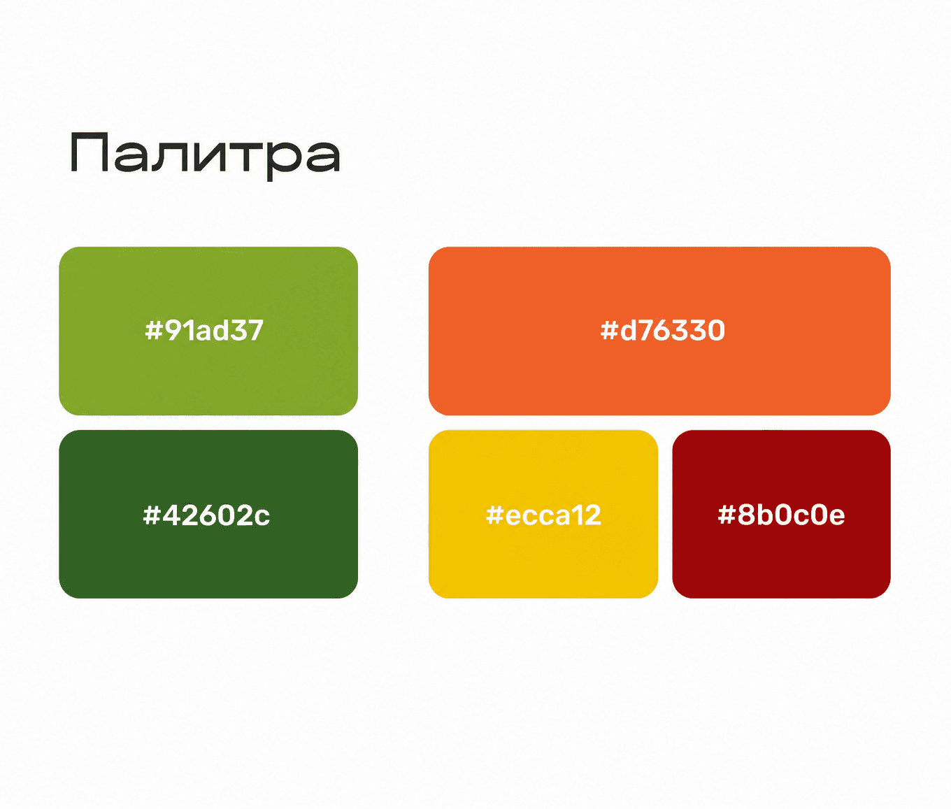
Building on the existing identity, we systematized the color palette, typography, and layout principles. Natural greens were complemented by warm orange, yellow, and burgundy accents, while Seenonim Sans and Rubik formed the core type pairing.
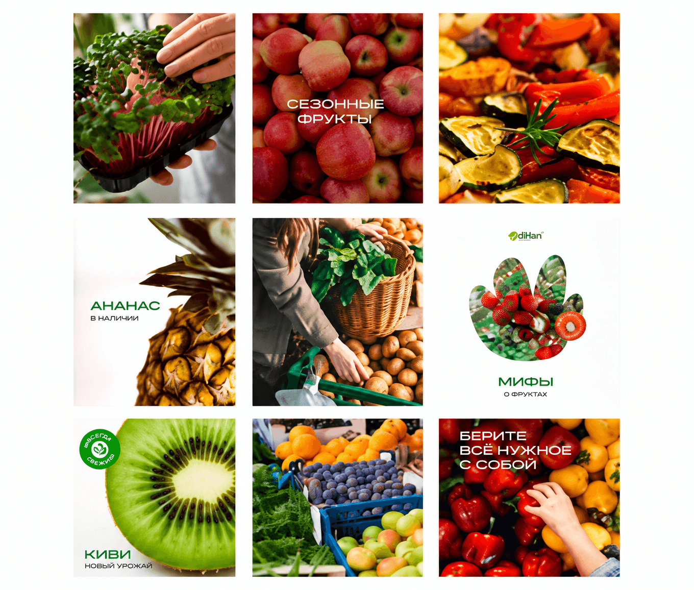
The photography style focused on the authentic in-store experience: natural light, spontaneous compositions, and minimal retouching. We created consistent templates for the feed, stories, and highlights, with cover graphics inspired by the small stickers commonly found on fresh fruit and vegetables.
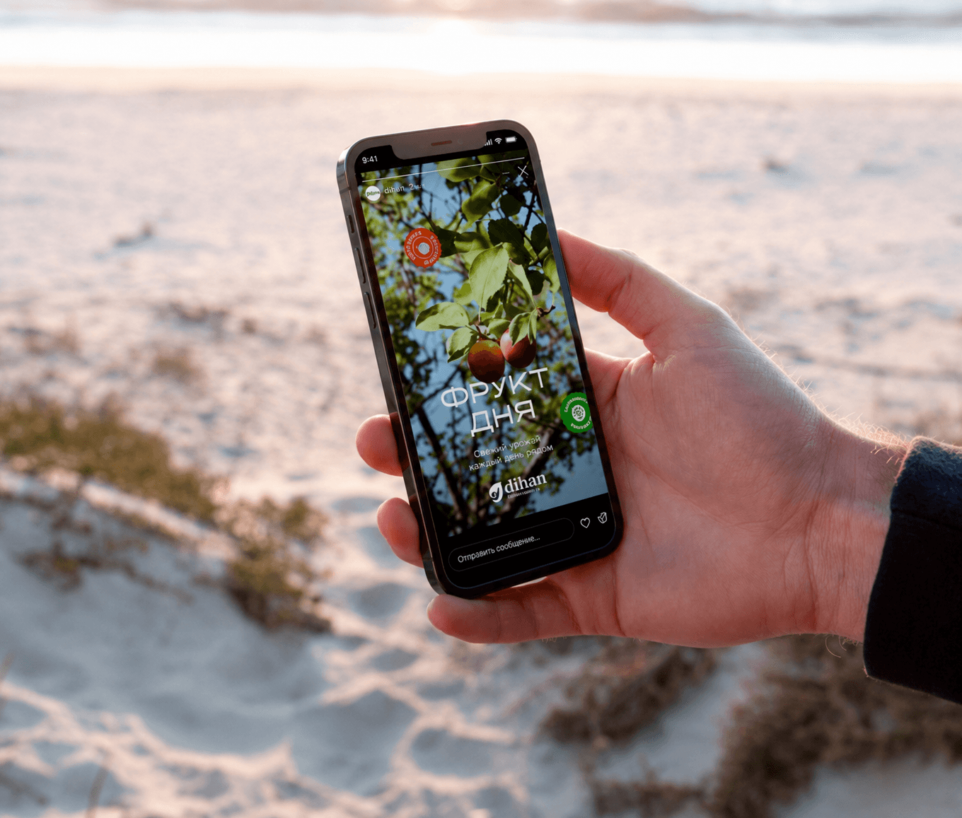
We updated the profile structure, prepared its description, added bilingual navigation for store locations, and created a multi-link page for orders and partnerships. This made the customer journey clearer for both retail buyers and Dihan’s business partners.
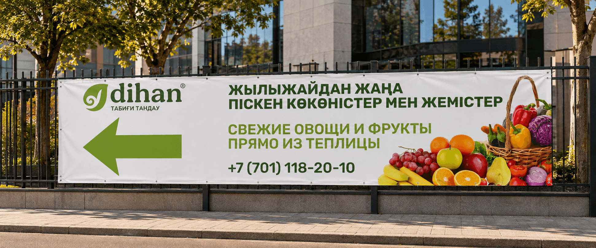
The visual principles were adapted across multiple formats—from social posts and vertical screens to a banner and billboard. The result was a connected system that preserved the brand’s natural, approachable, and recognizable character at every scale.
Results
Color, typography, photography, and layout rules brought Dihan’s communications into one consistent visual system.
The concept was carried across the profile, social content, stories, banner, and billboard.