
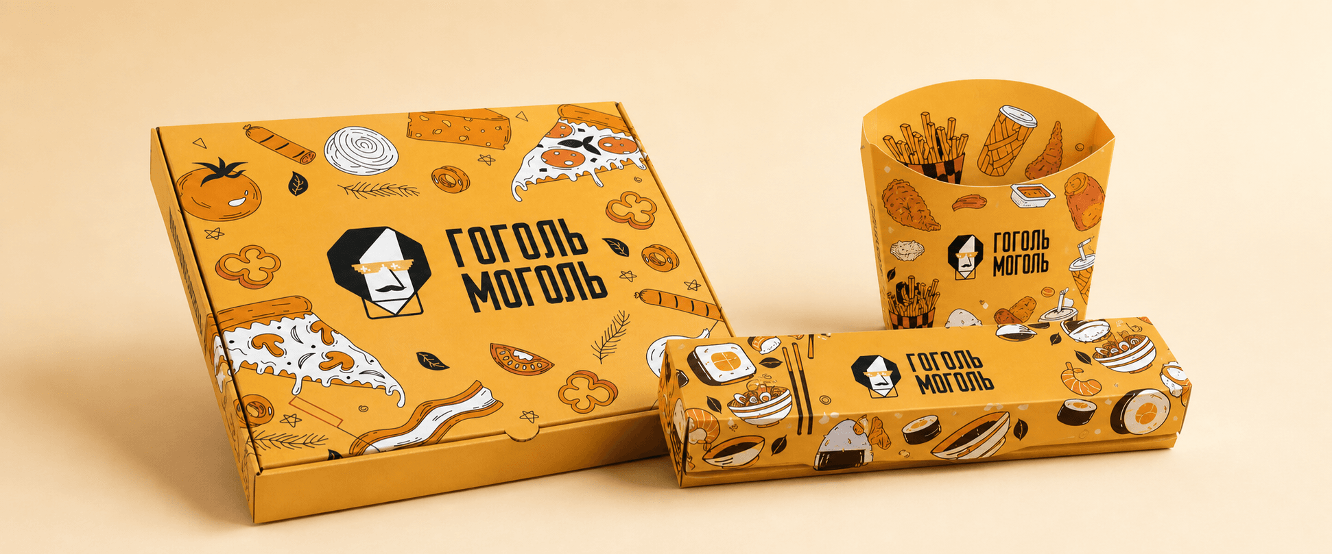
Gogol Mogol is a delivery service offering sushi rolls, pizza, and hot dishes, where visual presentation matters just as much as taste and product quality. Our task was to refresh the packaging design and align it with the brand’s updated visual identity.
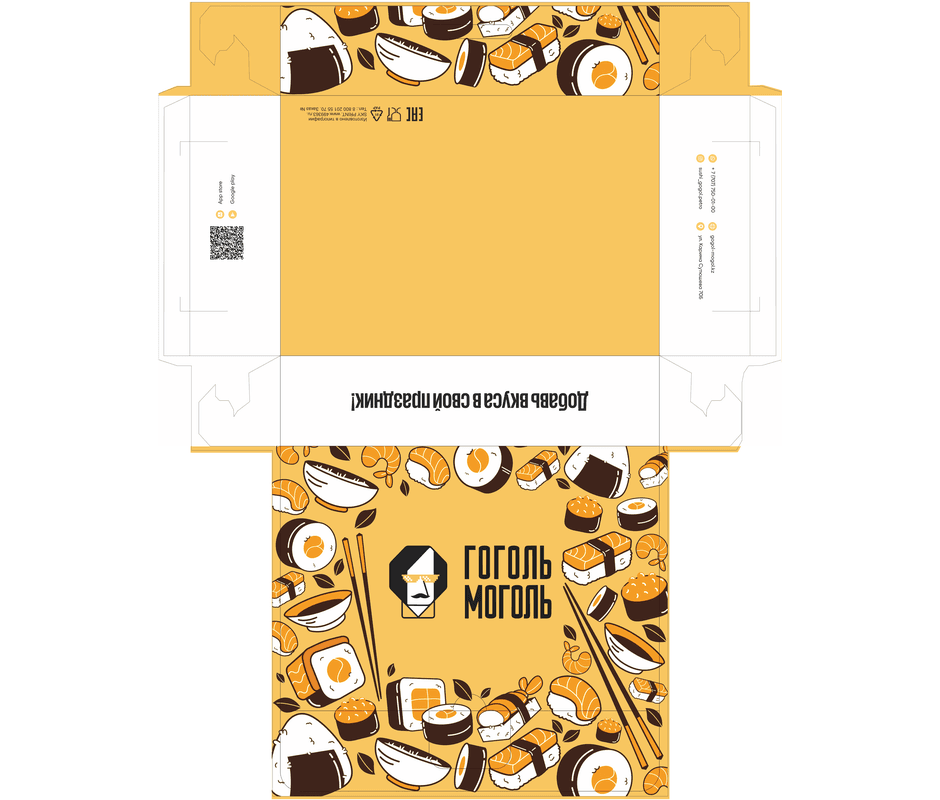
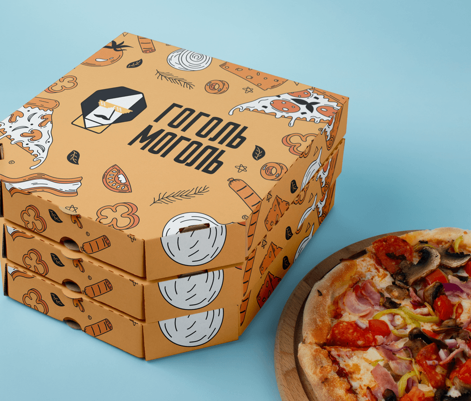
We subtly refined the logo while preserving its recognisability, refreshed the overall identity, and introduced more colour to make the packaging brighter and more expressive. The goal was to create a cohesive system that would work equally well across different formats—from pizza boxes to packaging for rolls, appetisers, and hot dishes.
The rebrand retained the familiar elements of the brand while giving them a more contemporary and energetic feel. We introduced a richer colour palette, strengthened the contrasts, and added distinctive graphics that make the packaging instantly recognisable among other delivery brands.
The new design supports Gogol Mogol’s positioning: quality food, attention to detail, and an aesthetically considered presentation. The packaging has become an integral part of the customer experience—from receiving the order to serving it at the table.
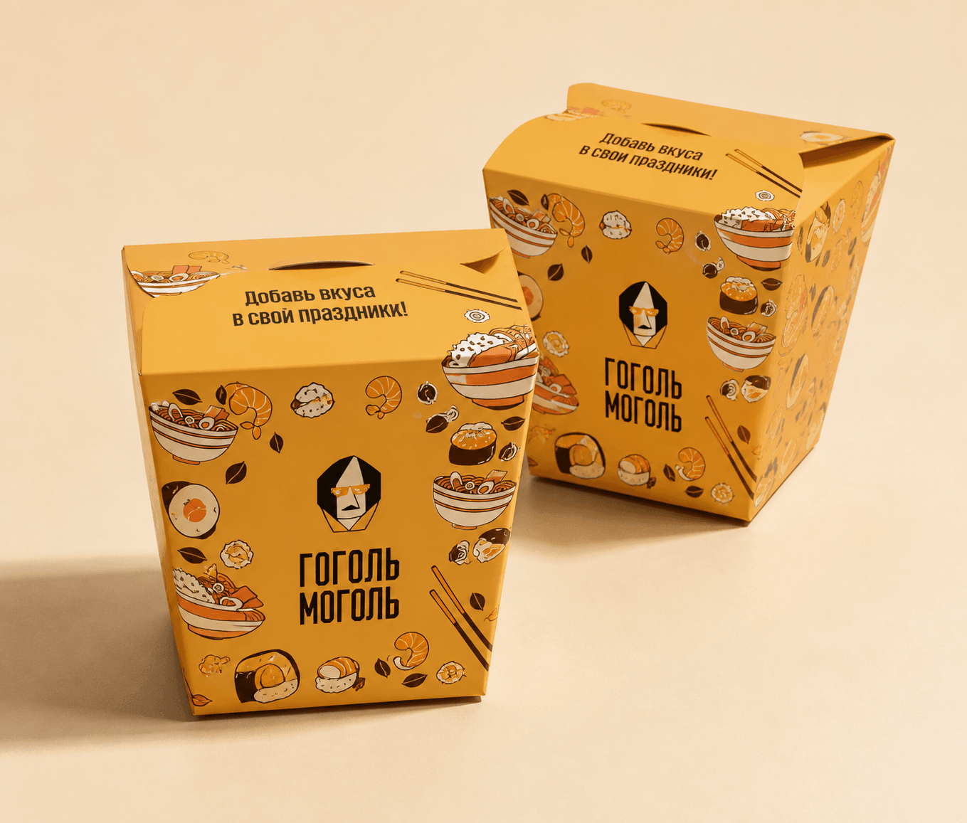
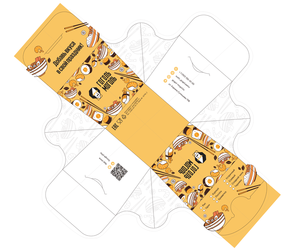
We adapted the refreshed identity to different packaging types and sizes while maintaining consistent principles for composition, colour, and logo placement. Each item has its own character while remaining part of a unified visual system.
As a result, the brand now has a flexible design system that can grow and evolve over time. New packaging formats, seasonal offers, and collaborations can be introduced without compromising brand recognition.
Results
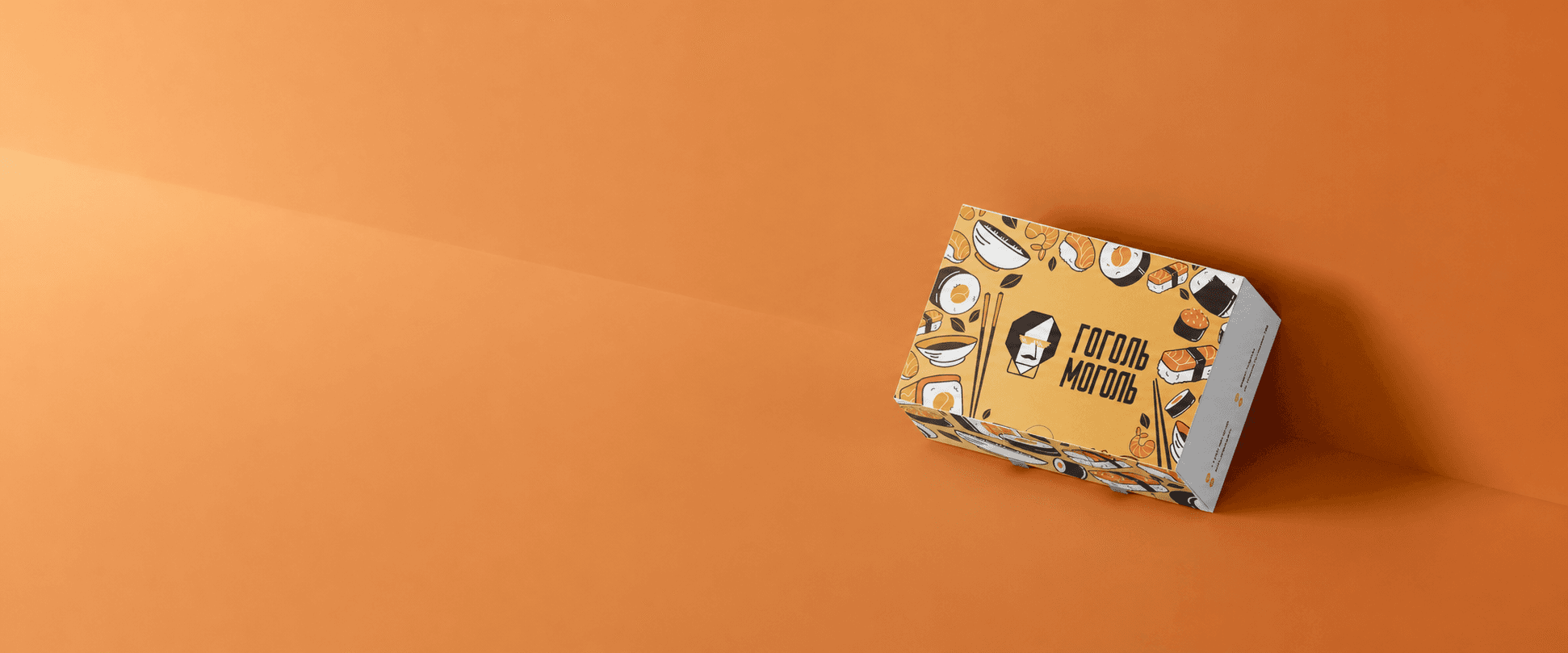
The refreshed colour palette and expressive graphics gave the packaging a more contemporary and noticeable appearance while preserving the brand’s distinctive character.
The refined logo and unified design system brought the different packaging formats together, strengthening visual consistency and enhancing the overall customer experience.