
Itakeli
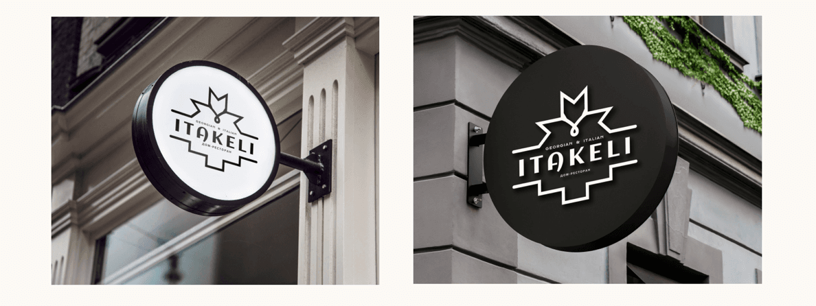
ITAКELI is a home-style restaurant where two great gastronomic cultures meet: Italy and Georgia. The founders created a unique product — signature cuisine at the intersection of two traditions. Our task was not to illustrate this connection through stereotypes, but to design a long-term system of meanings and a visual code that speaks about family values.
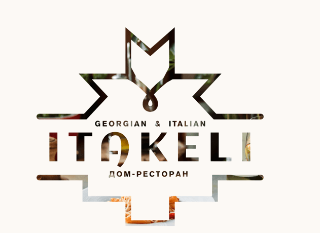
This was a comprehensive case: from systematic naming and brand archetype development to the logo, guidelines, menu, packaging, and visual strategy for Instagram. We took the project from the very beginning and transformed it into a complete brand with clear management standards.
We built the visual identity around three archetypes. The Sage represents expertise backed by facts: 48-hour dough fermentation, 450 degrees in the oven, and the “leopard crust” technique. This is the voice of an expert people trust. The Creator represents craftsmanship as meditation: every pattern and logo element is hand-drawn, creating a sense of authenticity and life. The Caregiver reflects Georgian hospitality and Italian family warmth, expressed through the soft and sincere tone of voice of a home-style restaurant.
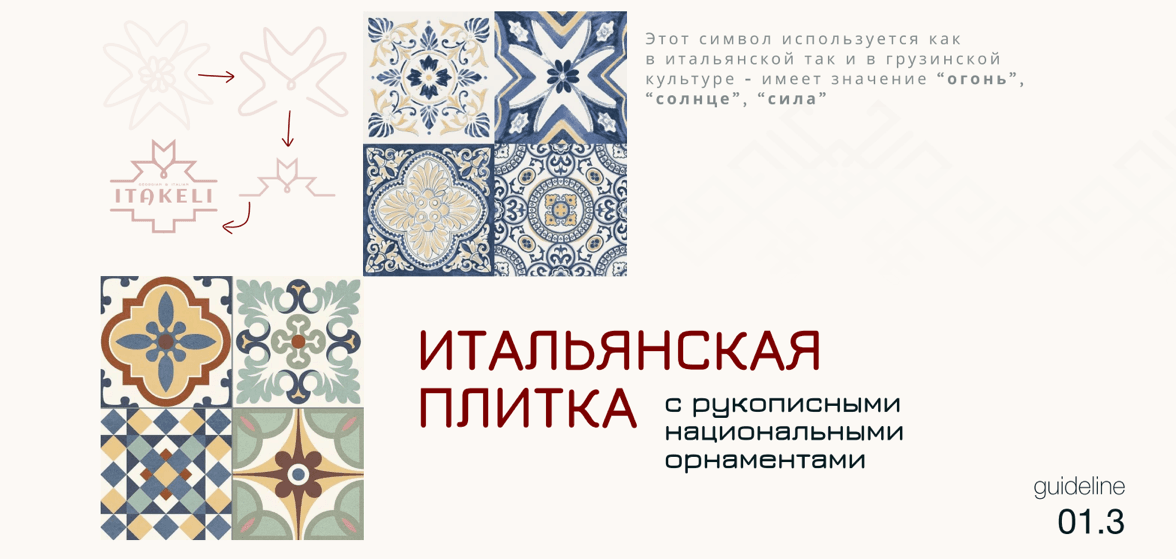
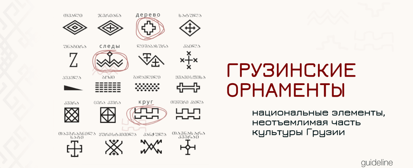
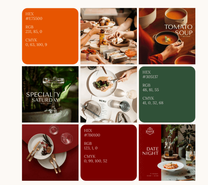
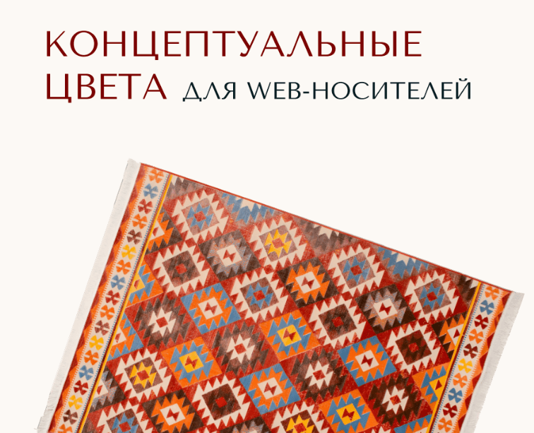
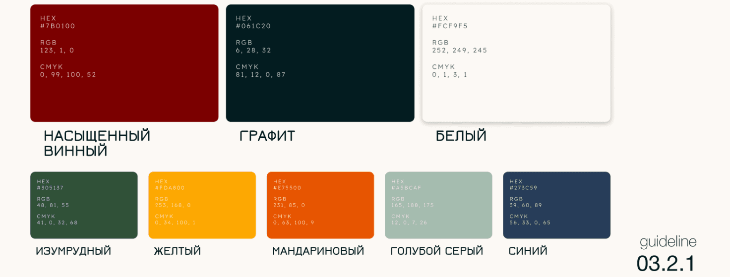
The visual language is ethno-modern: the strict geometry of traditional Georgian ornaments is combined with the refined aesthetics of Italian heritage. The color DNA — “Terroir” — includes deep wine, graphite, sand, and olive tones inspired by earth, ingredients, and wine culture. The Tenor Sans and Lora font pairing was designed as a dialogue between two cultures: elegant headlines and intelligent body text.
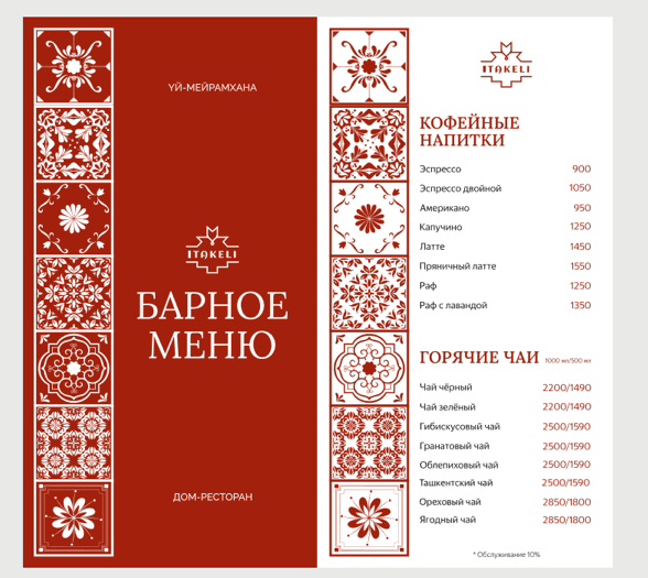
We connected all touchpoints into one unified and manageable system. The menu was structured according to positioning: the core direction (a balance of two cultures), brunch (the morning aesthetics of a home-style restaurant), and specials (seasonal accents from the chef). Branding expanded beyond the restaurant walls — packaging, stickers, and festive design transformed the brand philosophy into tangible details that guests take with them.
The Instagram content strategy was built as a visual series with four content directions: Savory (textures and the physical beauty of food), Date Night (atmosphere and emotions), Sunday (home and family), and Living Branding (seasonal color evolution — from emerald to tangerine tones). The result of the work was a 26-page guideline that protects the uniqueness of the project and ensures a consistent brand image at every touchpoint.
Results
Brand management standards
Strategy → Logo → Brand identity → Menu → Packaging → Brand materials
- Naming
- Archetypes
- Visual code
- Content system
From an idea to a complete system of visual leadership