

Uprize
Uprize is a technology platform that helps businesses make more informed decisions, improve efficiency, and turn data into measurable results. Our task was to create a visual identity that would communicate not only the technological nature of the product, but also its central idea — helping businesses move upward.
The logo is built around an upward-pointing arrow. It simultaneously represents growth, scaling, goal achievement, and moving to the next level. The dynamic geometry creates a sense of acceleration, while the contrasting UPRIZE wordmark makes the brand distinctive and highly legible across both digital and physical media.
A vivid purple was selected as the primary brand colour, representing energy, ambition, and innovation. The gradient enhances the sense of movement and makes the logo more expressive across interfaces, social media, and advertising materials. Yellow is used as a secondary accent to highlight important details and calls to action.
The typography system combines the functional Inter typeface with the more distinctive Clear Sans Infinity. This approach maintains clarity and readability within interfaces while giving headlines and communication materials a recognisable character. Black, white, grey, and muted purple tones provide contrast and support the brand’s modern technological aesthetic.
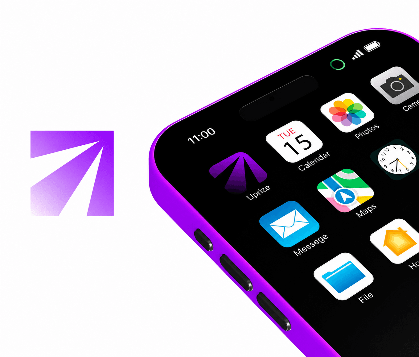
We developed more than a standalone logo — we created a complete visual system that works consistently across the website, mobile application, social media, presentations, and printed materials. Simplified versions of the symbol were prepared for smaller formats, while clear-space, contrast, and background usage guidelines ensure consistency across every brand touchpoint.
Uprize’s visual communication is built around dynamic compositions, bold typography, and imagery associated with growth, scale, and upward movement. As a result, the brand received a cohesive and flexible identity that reflects the nature of a modern digital product and can evolve as the platform enters new markets and industries.
The graphic language of Uprize is based on expressive minimalism, simple forms, confident lines, and clear visual metaphors. The icons were created in a consistent bold monoline style without unnecessary decoration, allowing them to be quickly understood across both the product interface and promotional materials.
The imagery was selected to convey scale, movement, and ambition. Architecture, height, open spaces, directional lines, and images of overcoming challenges support the brand’s central idea — transforming ideas into growth and helping businesses reach the next level.
Particular attention was given to how the identity would perform across digital channels. Dedicated logo versions were created for the application, social media, favicon, and smaller interface formats, where simplicity, contrast, and recognition at minimal sizes are especially important.
The brand identity also established principles for the website, mobile application, and social media design. Clean structure, bold accents, dynamic compositions, and consistent use of the brand colours create a unified user experience and maintain Uprize’s recognition across all digital platforms.
Results
Uprize received a modern identity that communicates the product’s key qualities: technology, growth, ambition, and forward movement. The upward-pointing symbol became a visual representation of business development and scalability.
In addition to the logo, we created usage guidelines, a colour palette, typography, graphics, icons, and principles for working with imagery. All elements were combined into a unified system that preserves brand recognition across different formats and media.
The identity was adapted for the website, mobile application, social media, interfaces, and smaller digital formats. A dedicated application icon, simplified versions of the symbol, and contrasting variants for light and dark backgrounds were developed.