VIRO
VIRO is a company specializing in architectural glass solutions, where not only aesthetics matter, but also engineering precision, safety, and trust. Our task was to create a symbol that combines manufacturing technology, premium perception, and a modern approach to space design.
The logo development process was not just about finding a beautiful form, but about creating a visual language for the brand: from strategic foundations and meanings to a complete system for using the logo across different brand touchpoints.
Before creating the logo, we formed the foundation of the brand: we studied the audience, product features, and VIRO’s key advantages. The concept was based on three archetypes — the expertise of the Sage, the scale of the Ruler, and the aesthetics of the Creator, reflecting engineering experience, reliability, and work with modern interiors.
Based on the strategy, a series of logo concepts was developed. Each idea had its own logic: from conveying the solidity and strength of the structure to expressing the transparency, light, and visual elegance of glass.
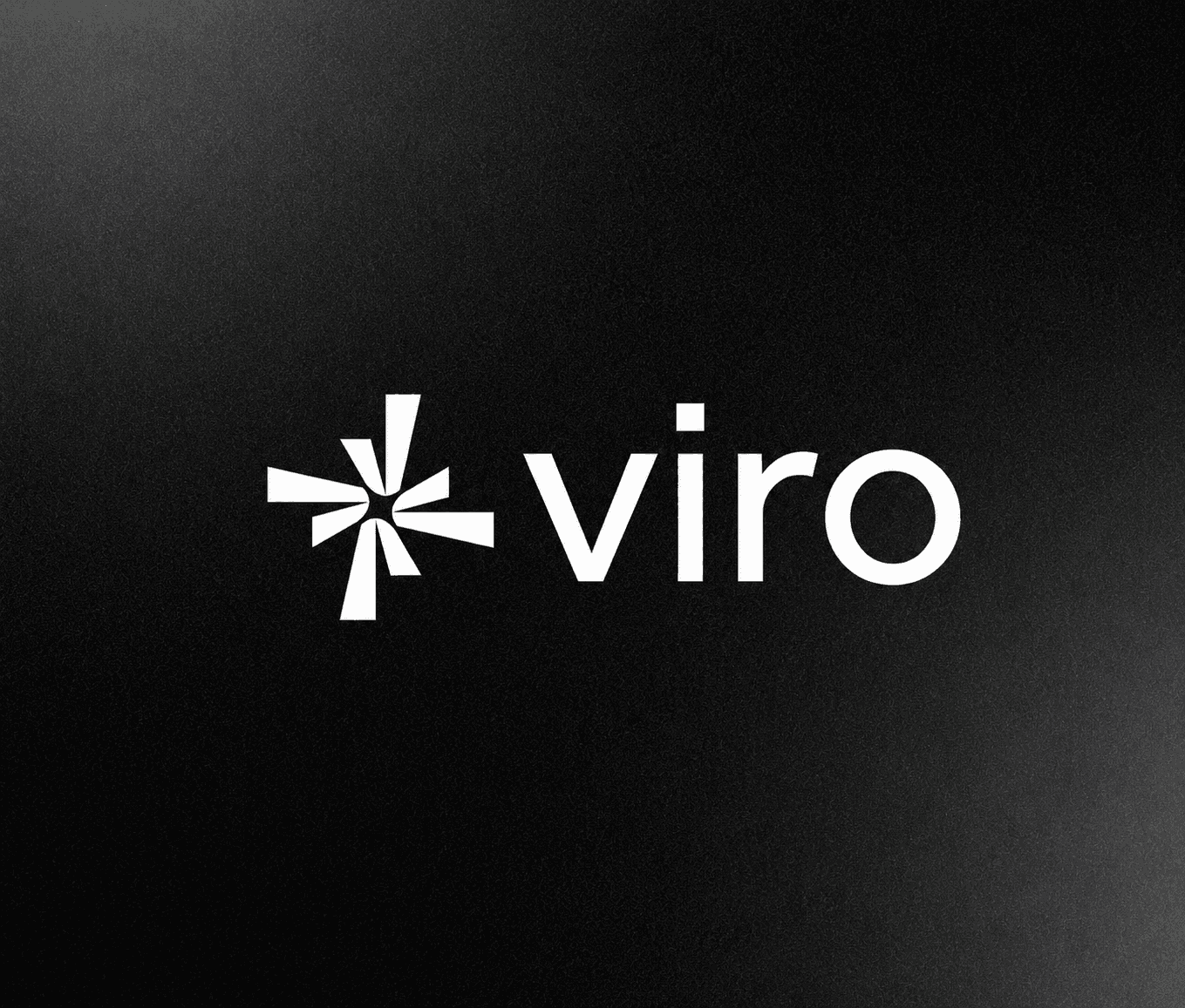
We did not limit ourselves to a single direction: the team prepared several visual solutions, exploring different ways to express the brand’s character through form, typography, and graphic elements.
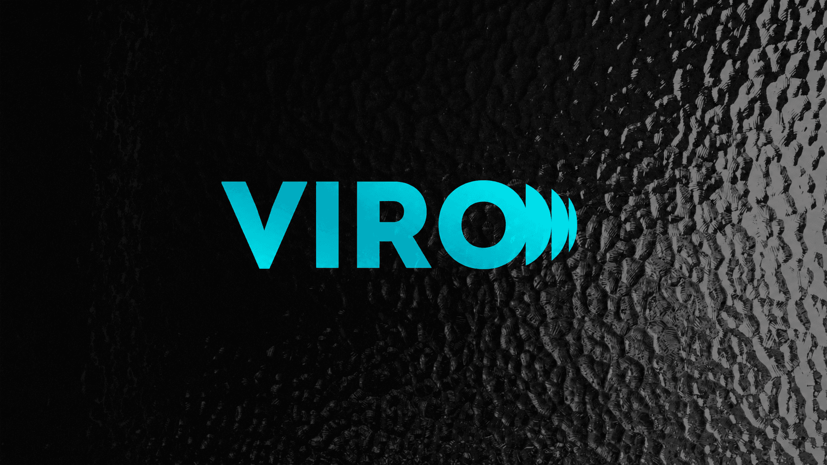
After analyzing the concepts, a direction with a dynamic accent in the letter “O” was selected. The graphic element conveys the texture of glass, the play of light, and the tactile nature of the material, while maintaining a sense of technology and confidence.
After approving the logo form, we moved on to finding the optimal color solution. Various combinations of shades were tested to achieve a balance between premium perception, purity, and associations with the glass industry.
The final palette was built around turquoise and aquamarine tones — colors that represent transparency, freshness, and modern architectural solutions. The logo was adapted for digital environments, print materials, and various application formats.
The result of our work was a complete VIRO logobook: a system of guidelines that allows the brand to maintain a consistent visual style across all customer touchpoints.
We prepared the main versions of the logo, color palette, usage guidelines, and placement options across backgrounds and brand materials. As a result, the new symbol works not only as a design element, but also as a tool for increasing brand recognition.
Results
A modern logo was created, reflecting the technology, quality, and aesthetics of glass solutions.
A logobook was developed with usage guidelines, colors, and adaptations for different communication channels.
The brand received a complete visual foundation for growth, communication, and expansion into new markets.